Taiwan Designers Win 24 Prizes at iF Communication Awards 2010
2010/09/01 | By Quincy LiangThe judges for the 2010 iF communication design award evaluated some 1,213 entries of a total of 1,687 from 26 nations that met the criteria, handing out 499 awards to 480 entries, including 24 to Taiwanese designers, compared to 16 in 2009, according to iF Taiwan, the local branch of the International Forum Design (iF) of Germany.
Summing up the gist of what separates winners from also-rans, the jury said, “works of outstanding craftsmanship, eschewing tame design, playful approaches, avoiding childishness.”
The iF communication design award basically honors outstanding works in seven categories that revolve around conveying message via various media.
1. Digital Media: Animation; atmosphere; interface; screen design; information architecture; viral qualities; digital advertising; and humor.
2. Product Interfaces: All graphic interfaces between user and product.
3. Print Media: Image; information; merchandising; typography; photography; corporate communication; and publishing media.
4. Packaging: Sales and transport packaging; and displays.
5. Corporate Architecture: Trade shows and exhibitions; events; shops/showrooms; permanent architecture; communication media for architecture and public spaces.
6. Crossmedia: Entries that are part of a more complex overall concept and that at least combine digital and print media.
7. “Too good to be true”: Special category for pieces that have never been implemented and for experimental concepts from all categories.
Specifically the judges based their decisions on how the designers communicated and packaged each message and work, evaluating criteria as animation, atmosphere, interface, screen design, typography, sound, photography, product communication, image, sales promotion, target group-specific communication, quality of detailing and corporate publishing.
The CENS editorial team has selected 11 of the 24 Taiwanese winners of the iF Communication Awards, whose works are profiled below.
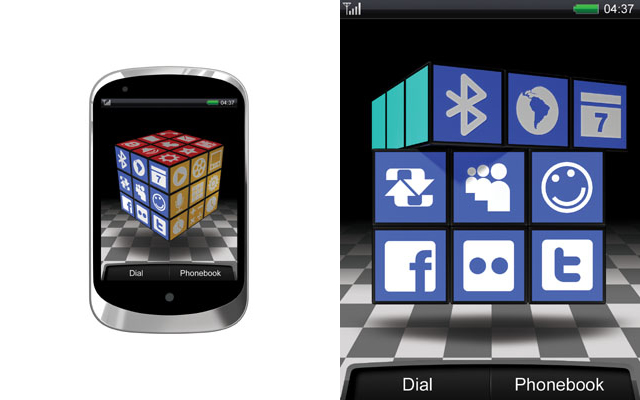
Inspired by the Rubik's Cube, this user interface for handheld mobile devices allows a user to turn freely to access all its different faces. Users can personalize their own menu, as well as have fun turning the cube to access desired functions in various modes, such as talking, playing music or photo browsing, as if using an interesting puzzle. FunQuick takes a new approach to mobile device user interface, literally turning the usual square form into an amusing alternative with a twist of the Rubik's Cube.
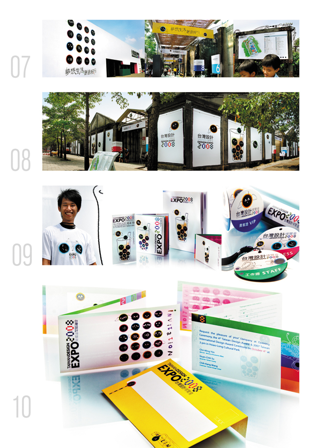
This is a printed entry featuring the “pearl tea latte,” a cool drink prepared by shaking latte iced tea and tapioca pearls that was launched some years ago and has become a virtual icon of innovative Taiwanese beverage. The glass of foamy tea draws attention with playful round "pearls" featuring diverse symbols and icons. Some of the pearly emoticons soar with wings of creativity, while others morph into beetles, butterflies, bicycles, tambourines, or bus-stop design that builds a bridge of dialogue between Taiwan's centuries-old tea culture and young people through the coolest online language used presently.
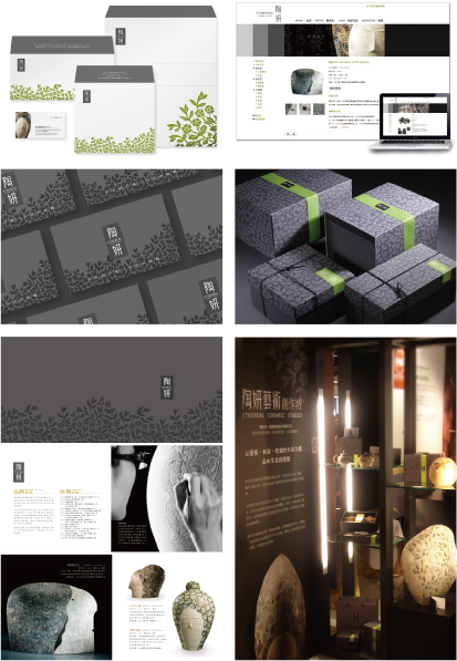
Ceramic artist Jou Miaw-Wen, also honored with "Outstanding Achievement in Taiwan's Craft Industry," creates a line of ceramics seemingly animated, rhythmic and in motion. Targeting art collectors, the Ethereal brand of ceramics is easily identified by its distinctive core colors of black and bottle green, highlighting Ethereal Studio's prolific strength to allow the brand to display its subdued and unique creations.
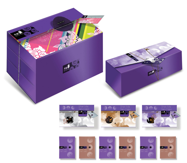
A line of packaging specially designed for SHAN MAI FOOD, a Taiwanese pastry maker who has adopted taro pastries to build its own brand, this entry highlights the brand image with cursive painting of round taro pastries. Other notable merits include modularly-designed gift box that save cost and packaging time; marketing of a single product with diversified packaging combinations; and gift box exclusively made for the grand opening of the Q Square Mall in Taipei.
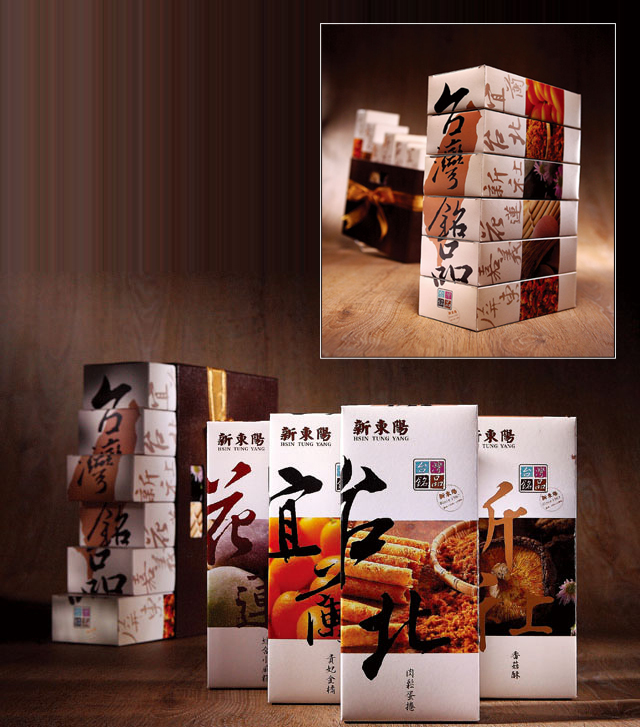
Hsin Tung Yang, a renowned retailer of local delicacies and edible gifts, entered the “Taiwan Best Specialty” as a packaging design. Containing timeless local delicacies from around Taiwan, this gift box features kumquats from Yilan, egg rolls with dried meat from Taipei, dried mushroom cakes from Shinshou, pastries from Chiayi, dried shrimps from Donggang, and sweet-rice pastries from Hualien, making an all-in-one tapas treat. Besides using eco-friendly concepts to design this packaging, the designer also adopts a leather-like magazine box neatly knotted with a golden string to optimize the richness of Taiwan culture.
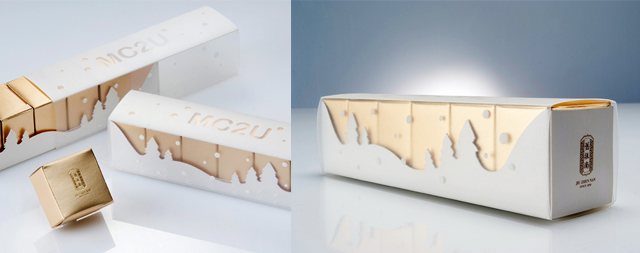
MC2U (Merry Christmas to You) is a special Christmas gift-box packaging created by Jiu Zhen Nan for the now classic pineapple cake, a matchbox-sized cake with pastry shell and pineapple filling that is a favorite souvenir for Taiwan-bound tourists. The catchy, simple design of the packaging proved very popular during the holiday season. Using the standard "gold" box for the pineapple cake, the designer creates a very practical packaging using gold with white to communicate a timeless holiday spirit.
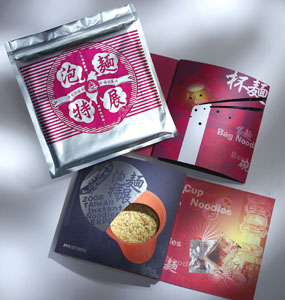
This Exhibition Catalogue was designed exclusively for the Instant Noodles Expo. Mimicking the packaging of a bowl of instant noodles, the catalogue has an outer bag with two complimentary bookmarks inside, each symbolizing an oil packet and seasoning packet; while the visual imagery of the inner pages fully highlights the role of instant noodles in Taiwan as popular, localized, and appetizing food.
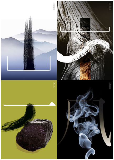
Perhaps literally a play on words or Chinese characters, this poster taps the meaning of significant components that make up traditional Chinese characters, which carry a rich variety of images and brim of associations. Mixing and matching these characters and images with modern graphic design can add new twists to their interpretation. The designer cleverly shows how deconstructed Chinese characters can convey sense as laid out by the image, manipulating a reader's perception in a way.
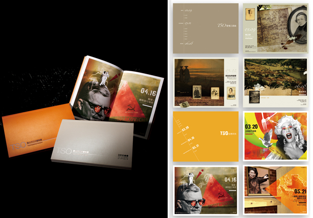
Meeting Taipei Symphony Orchestra's (TSO) need to build presence as the group has been playing many international concerts, Elite Brand created a brochure that is distinctive both visually and functionally. Taking into consideration TSO opinions, the designer utilizes bright-orange cover to impart a trendy look to a musical group usually seen as traditional. With a double-page insert presenting the mood of each concert, the brochure has a special double-cover that can be flipped from either side, successful show TSO as a group with style, a difference, but consistently exciting.
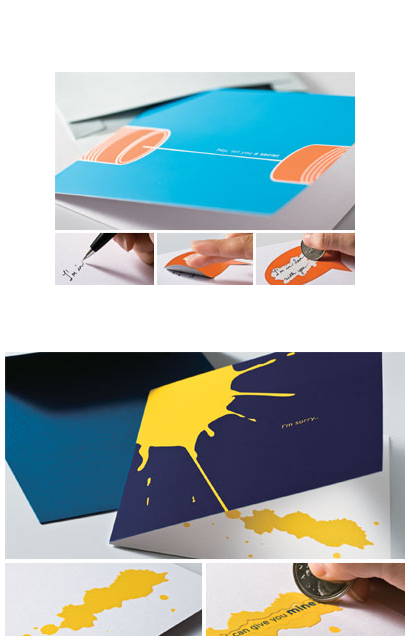
Cache-Cache Design's entry is a novel approach to greeting cards. The Scratchie Cards series features boldness stressed by simple graphics, daring colors and a cheeky voice. The cards provide new emotional experience and interaction by duplicating the scratch-and-win lottery ticket experience. The concept is to cause anticipation, curiosity, excitement as a recipient scratches a card to reveal hidden messages. Two types of cards are available: one with hidden messages and another being blank cards with Scratchie Stickers, which allow customization by applying stickers over secret messages.
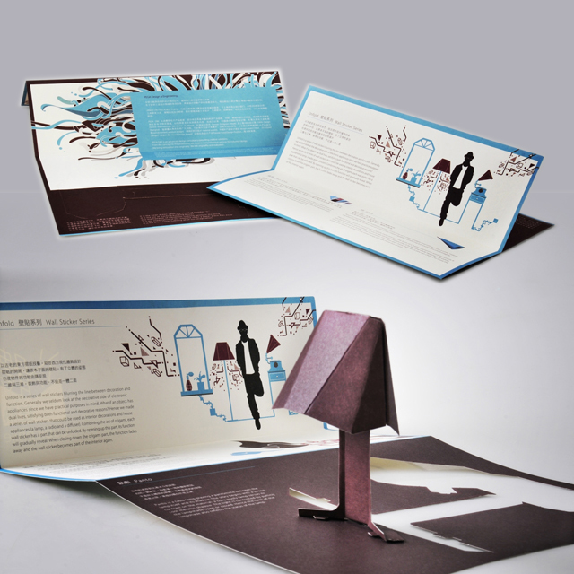
In 2009, PEGA D&E presented a novel interpretation of origami art at the 100% Design Exhibition in Shanghai, where the promotional material for the exhibition clearly echoed the products on display. This entry is a series of wall stickers blurring the line between decoration and function. PEGA D&E: "Generally we seldom look at the decorative side of electronic appliances since we have practical purposes in mind. What if an object has dual lives, satisfying both functional and decorative needs? Hence we made a series of wall stickers that double as interior decorations and household appliances as lamp, radio and diffuser."


